Showing posts with label effect. Show all posts
Showing posts with label effect. Show all posts
Monday, 21 April 2014

Friday, 18 April 2014
OUGD503: Studio brief 1 - Effect Final Boards
Here are the boards that I handed in to YCN:


WebRep
currentVote
noRating
noWeight
Tuesday, 1 April 2014
OUGD503: Studio brief 1 and 2 Crit
Today we had a crit for the whole of OUGD503. First we looked at collaboration work, and then we focused on our individual work.
Collaborative feedback:


Feedback:
> High quality photographs, some really well constructed photographs.
> Labels are really well constructed and designed. The colours are a clever way of making each bottle stand out.
> The clear labels work really effectively. This simplistic approach works well and the consistency is really strong, good job.
> Work on your campaign more instead of so much on the bottle design.
> The Matcha Tea label is difficult to read.
> The transparency of the labels conveys its water rather than juice, which works well.
> Strong illustration
> Very fresh, realistic product range.
> Photography adds to the overall impact.
> Clever use of colour to communicate the flavour of each bottle, it creates an individual density for each.
> Very strong and fresh design.
> Love the illustration style.
> Different that the labels are see-through.
> Works as a consistent cohesive unit.
> Consider changing the lids, try other colours.
Most of the feedback was very positive which is nice to hear. To take the feedback into use I think we'll try photoshop the lid colours to see how it looks and whether to use it or not. There isn't much we can do now about some of the labels being hard to read, apart from trying to use photoshop to enhance the labels. I think we now need to just focus down on the campaign and make sure its up to as much as a professional level as our designing has been.
Individual feedback:
I displayed my YCN Effect brief boards, a logo I have designed, a poster for posterheros and my secret 7 work.


Presentation:
Strengths:
Well presented boards for 'effect' - clear and simple.
Suggestions:
> Could do with somebody copy on Effect boards to describe the brief and chosen concept - Same applies for other boards.
> Development shown for photography logo - mock ups and branding guidelines could be developed.
> Secret 7 and photography logo could do with some text - Who is the artist? Explain the brief.
> Need an impact board
> Show evidence of development
Project Management:
Strengths:
> For the logo - Loads of different combinations of logo colours/ styles.
> A lot of work gone into final products.
> Effect brief - strong outcome with mixed media solutions.
> Ability to work on colab and responsive.
> Evidence of project management on boards.
Suggestions:
> Evidence processes and development more.
> More story telling is needed but done waffle - just a bit of background info.
> Do more briefs for responsive.
> Short briefs are shown - more big briefs would be ideal to fill out module report.
> Development processes shown, but final resolutions could be executed better.
Other comments:
> Hard to crit work as no briefs have been supplied discussing the projects and concepts chosen.
> Spelling mistakes - 'habit' on Posterhero's brief.
Collaborative feedback:
Feedback:
> High quality photographs, some really well constructed photographs.
> Labels are really well constructed and designed. The colours are a clever way of making each bottle stand out.
> The clear labels work really effectively. This simplistic approach works well and the consistency is really strong, good job.
> Work on your campaign more instead of so much on the bottle design.
> The Matcha Tea label is difficult to read.
> The transparency of the labels conveys its water rather than juice, which works well.
> Strong illustration
> Very fresh, realistic product range.
> Photography adds to the overall impact.
> Clever use of colour to communicate the flavour of each bottle, it creates an individual density for each.
> Very strong and fresh design.
> Love the illustration style.
> Different that the labels are see-through.
> Works as a consistent cohesive unit.
> Consider changing the lids, try other colours.
Most of the feedback was very positive which is nice to hear. To take the feedback into use I think we'll try photoshop the lid colours to see how it looks and whether to use it or not. There isn't much we can do now about some of the labels being hard to read, apart from trying to use photoshop to enhance the labels. I think we now need to just focus down on the campaign and make sure its up to as much as a professional level as our designing has been.
Individual feedback:
I displayed my YCN Effect brief boards, a logo I have designed, a poster for posterheros and my secret 7 work.
Presentation:
Strengths:
Well presented boards for 'effect' - clear and simple.
Suggestions:
> Could do with somebody copy on Effect boards to describe the brief and chosen concept - Same applies for other boards.
> Development shown for photography logo - mock ups and branding guidelines could be developed.
> Secret 7 and photography logo could do with some text - Who is the artist? Explain the brief.
> Need an impact board
> Show evidence of development
Project Management:
Strengths:
> For the logo - Loads of different combinations of logo colours/ styles.
> A lot of work gone into final products.
> Effect brief - strong outcome with mixed media solutions.
> Ability to work on colab and responsive.
> Evidence of project management on boards.
Suggestions:
> Evidence processes and development more.
> More story telling is needed but done waffle - just a bit of background info.
> Do more briefs for responsive.
> Short briefs are shown - more big briefs would be ideal to fill out module report.
> Development processes shown, but final resolutions could be executed better.
Other comments:
> Hard to crit work as no briefs have been supplied discussing the projects and concepts chosen.
> Spelling mistakes - 'habit' on Posterhero's brief.
WebRep
currentVote
noRating
noWeight
Tuesday, 11 March 2014
OUGD503: Studio brief 1 - Effect Final Development
So I decided that it was more appropriate to have a slogan on my posters that would kind of make sense of what they were about.
I tried out some different slogans, I really didn't want it to sound to cheesy:
> Down your imagination
> Quench your imagination
> Down your creativity
> Quench your creativity
> Top up your creativity
> Release your creativity


I decided to go with 'Quench your creativity'.
I also was told to maybe add a link to the twitter page on the posters, this then gave the audience something to interact with, and also gave them a site to visit where they could find out what the posters are about.
I tried different compositions to see what looked better and which worked most effectively


Here are the final posters:
In the end I used Marilynn Monroe, Salvador Dali, Jimi Hendrix, Audrey Hepburn, Mona Lisa, Albert Einstein, Elvis Presley.


I also added the two pack shots of the can into the poster design:


I tried out some different slogans, I really didn't want it to sound to cheesy:
> Down your imagination
> Quench your imagination
> Down your creativity
> Quench your creativity
> Top up your creativity
> Release your creativity
I decided to go with 'Quench your creativity'.
I also was told to maybe add a link to the twitter page on the posters, this then gave the audience something to interact with, and also gave them a site to visit where they could find out what the posters are about.
I tried different compositions to see what looked better and which worked most effectively
After finalising a layout for my posters I added all the different famous faces onto the template. I also drew up three more people as I didn't think four was enough:
In the end I used Marilynn Monroe, Salvador Dali, Jimi Hendrix, Audrey Hepburn, Mona Lisa, Albert Einstein, Elvis Presley.
I also added the two pack shots of the can into the poster design:
WebRep
currentVote
noRating
noWeight
Monday, 10 March 2014
OUGD503: Studio brief 1 - Effect Development
From the crit I decided that I would have the posters all in the same red, to keep with the brand identity:


I also came up with the idea of maybe having posters which have riddles on it. The brief asked for a campaign which grabbed peoples attention and made them question what they were seeing. I thought maybe having riddles on some posters, then having to scan a QR code to get the answer.

I also came up with the idea of maybe having posters which have riddles on it. The brief asked for a campaign which grabbed peoples attention and made them question what they were seeing. I thought maybe having riddles on some posters, then having to scan a QR code to get the answer.
WebRep
currentVote
noRating
noWeight
Wednesday, 12 February 2014
OUGD503: Studio brief 1 - Effect Crit
In groups of six, we paired up and critiqued another pairs work, my work was looked at by Kirsty and Danielle.
Here are the boards which I presented:
Here is the feedback which I received from them:


> Think about your audience, is it going to be aimed at all university students, or maybe just art students, or music students?
> Check your boards are relevant, you have two boards that are very similar, maybe get rid of one and make one more of an impact.
> Think about mocking up onto other things rather than just bus stops. Billboards, side of buses?
> Think about colour, why red green yellow and blue? maybe keep it all red like the effect logo?
> Maybe you could have spillage an actual liquid, rather than an illustrator, but this depends on whether you can pull it off in photoshop.
> On your boards, more text to explain what it is.
Here are the boards which I presented:
Here is the feedback which I received from them:
> Think about your audience, is it going to be aimed at all university students, or maybe just art students, or music students?
> Check your boards are relevant, you have two boards that are very similar, maybe get rid of one and make one more of an impact.
> Think about mocking up onto other things rather than just bus stops. Billboards, side of buses?
> Think about colour, why red green yellow and blue? maybe keep it all red like the effect logo?
> Maybe you could have spillage an actual liquid, rather than an illustrator, but this depends on whether you can pull it off in photoshop.
> On your boards, more text to explain what it is.
WebRep
currentVote
noRating
noWeight
Saturday, 25 January 2014
OUGD503: Studio brief 1 - Effect - Design development
After presenting my boards I took the advice and changed my design a little bit:
I decided that I was going to have famous musicians, scientists, artists, and recognisable figures in my posters, instead of the liquid spelling a word:
I picked four people which I thought were appropriate to the idea:
> Mona Lisa
> Elvis
> Jimi Hendrix
> Albert Einstein


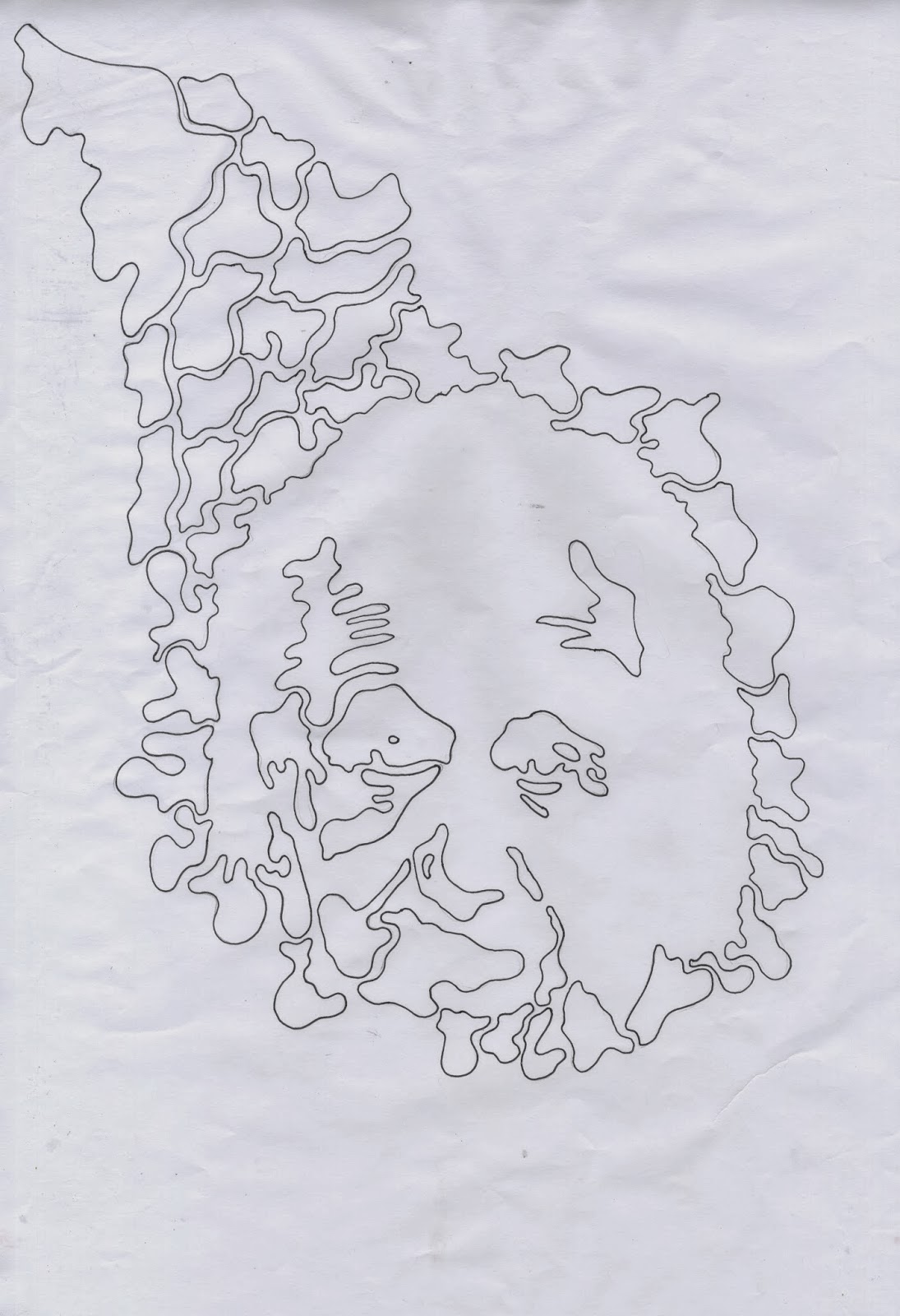
I drew them onto paper first and then scanned them in to edit them in illustrator:


Here are the posters I came up with:


I also mocked up some coasters, a leaflet and a goody bag:
Coaster:


Canvas bag:

Leaflet:

I also mocked up the poster in bus stops and at shopping centres:


I decided that I was going to have famous musicians, scientists, artists, and recognisable figures in my posters, instead of the liquid spelling a word:
I picked four people which I thought were appropriate to the idea:
> Mona Lisa
> Elvis
> Jimi Hendrix
> Albert Einstein
I drew them onto paper first and then scanned them in to edit them in illustrator:
WebRep
currentVote
noRating
noWeight
Here are the posters I came up with:
I also mocked up some coasters, a leaflet and a goody bag:
Coaster:
Leaflet:
I also mocked up the poster in bus stops and at shopping centres:
Subscribe to:
Posts (Atom)