7 Contrasts:
Contrast of Tone
Contrast of Hue
Contrast of Saturation
Contrast of Extension
Contrast of Temperature
Complementary Contrast
Simultaneous Contrast
Colour study 1 Tone :First experiment I explored the contrast of tone. Following the images below you can see how comparing colours to others changes how you see the colours. The first colour I used I would describe as dark blue, but as I add colours with a deeper tone its interesting to see how that dark blues turns to more of a lighter blue. The increase of the darker tones shows how this happens. I've compared the first and the last blues in the last image to show the difference.
Colour study 2 saturation :
In this colour experiment I have explored Saturation. The first colour I placed down was a very saturated orange, It's almost pink. As I add less saturated oranges, because of the difference between saturations the original square seems to look more saturated. I added a green to show how saturation also effects the temperature.
Colour study 3 Temprature:
For my third experiment I looked at the temperature in colour. I started with Blue, you can see alone the two blues would be described as being cool. Adding darker blues makes the orignal blues look warmer and makes the dark blues look really cool. I then looked at the difference in warmth between yellow, red and orange. Starting with yellow, again they look like very warm colours. Compared to the red and orange it turns a lot cooler and the red and orange look much warmer. I then added the lighter blue to the warm colours which made the lighter blue look cool.
Colour study 4 Complimentary :
Looking at the complientary contrast, I explored the weight of the colours and wether this effected our eyes and how we see complimentary colours. From this experiment I noticed that the bigger the blocks of colour and the more even the weight distribution it was easier on the eyes but still not nice to look at. I found the worst way to use complimentary colours is to put them together in stripes.
Colour study 5 Extension:
Here I looked at weight, but I also looked at complimentary colours again to see if the weight really did matter when using complimentary colours. Purple is much cooler than yellow so this effected it quite a lot, i noticed that having three quarter purple and one quarter yellow was an even balance and less strain was put on the eyes. I also tried with none complimentary colours and found out that it didnt matter as much about the balance of colours.
Colour study 6 Simultaneous:
In this experiment i looked at simultaneous colours. You can see that when the green and yellow lines are together you can see blotches of red/ orange appear, i noticed it was easier to see when using stripes. It was interesting aswell when the black and white were together they made your eyes see a combination of different colours, almost a rainbow. With the orange and blue the colours merging almost created a dull grey.
Colour Study 7 weight and temperature:
I looked at the weight of colours and how the temperature could possibly effect how they can balance out. From looking at the images i couldnt really see a difference in how they went together, again like the other extension experiments I think three quarter of one colour and one quarter of another colour go together really well.
Colour study 8:
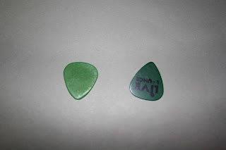
For my 8th colour experiment I took two coloured plectrums, one dark green and one white green, and looked at how the difference in hues for the background changed the way in which the two greens are seen together. For example wether the dark green would look darker, or the coloured backgrounds would make the light green look darker or lighter. I notcied on the green card and the lighter colours like blue and grey the greens looked much similar, as when the plactrums were on the orange and red cards, the much warmer colours you could tell much more easily that the two green were different.
Colour experiment 9:
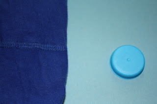
I then looked at the temperature in blues when placed on different coloured backgrounds. I chose a very dark blue and a very light blue. Like i expected on the warmer colours the blues stood out a lot more. I can also see how on the darker colours the darker blue looks to be more paler than on the lighter colours.
Colour experiment 10
For my 10th experiment I looked at what happened to the coloured objects when i changed the saturation of the back ground. With the blue items, they stood out a lot clearer and looked more blue when they were on the desaturated background. The reds oranges adn yellows looked a lot warmer when on the lighter blue card. For me i couldnt see a change in the green objects.


No comments:
Post a Comment