We were set the task of identifying '10 things that you need to know about Graphic Design'. These principles, faces or concepts had to be influenced by information learnt during our time on the course.
1. Colour theory
From our studio sessions with Fred I understand that colour theory is an important principle.
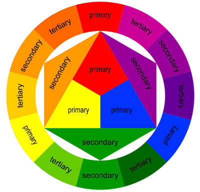
Your choice of colour is as important as your choice of type. Different colours can connote different feelings, for example red can show anger, Light blue connotes being calm.
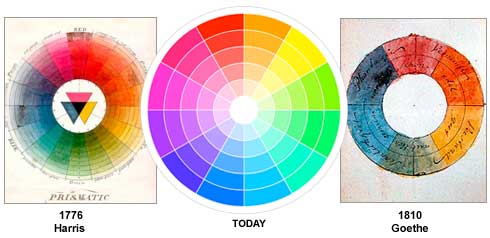
'The Color Wheel
A color circle, based on red, yellow and blue, is traditional in the field of art. Sir Isaac Newton developed the first circular diagram of colors in 1666. Since then, scientists and artists have studied and designed numerous variations of this concept. Differences of opinion about the validity of one format over another continue to provoke debate. In reality, any color circle or color wheel which presents a logically arranged sequence of pure hues has merit.'Reference: http://www.colormatters.com/color-and-design/basic-color-theory
2. Anatomy of Type
As typography is a fundamental principle of Graphic Design I've chosen the 'Anatomy of Type' for my second choice. I believe understanding your type is important if you you're going to be creating your own type, and it's interesting to understand the origins of type, and can also help when deciding what type to use for different design.


Different styles of type have different functions so understanding what sort of type you're working with can be extremely helpful in your design.
3. RGB and CMYK
It's important to understand the difference between RGB & CMYK. If your working with colour whether on screen or for print It'll save you a whole lot of time if you understand the two colour modes.
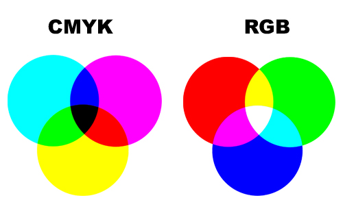
Colours vary so drastically on screen and on print and the wrong colour being used can effect your design massively.
From our colour study sessions:
RGB is also used when on the computer, designing
specifically for screen. CMYK is the combinations of colours which is
used for print.
'Televisions, cameras, scanners and computer monitors are based on the additive system of color (RGB), where red, green and blue light projected together yield white. Offset printing, digital printing, paints, plastics, fabric and photographic prints are based on the subtractive system of color (CMY/CMYK) in which cyan, magenta and yellow mix to form black (K).'
4. Layout and Grid
Layout and grid forms the structure of your design, grids are always optional but its very handy to understand the different techniques.
Fibonacci Sequence and Golden Section:
In mathematics, the Fibonacci numbers or Fibonacci series or Fibonacci sequence are the numbers in the following integer sequence:

The sequence allows for you to arrange your layout in a set way which is equal and in proportion. The Fibonacci sequence derives from sea shells as the spirals are all naturally in line and parallel.


If applying Fibonacci's sequence to type:
55 pt title should be complemented with 34pt body cop.
The Golden Ratio is similar to the Fibonacci sequence. It is a mathematical equation that is used to make things proportionate and aesthetically pleasing to the eye.
http://www.sciencedaily.com/releases/2009/12/091221073723.htm
'Also know the divine proportion, the golden ratio describes a rectangle with a length roughly one and a half times its width. Many artists and architects have fashioned their works around this proportion. For example, the Parthenon in Athens and Leonardo da Vinci's painting Mona Lisa are commonly cited examples of the ratio.'
"When you look at what so many people have been drawing and building, you see these proportions everywhere," Bejan said. "It is well known that the eyes take in information more efficiently when they scan side-to-side, as opposed to up and down."
1.62 is the golden number used to find the next rectangle in the sequence.
Rule of Thirds:
The Rule of Thirds
This is a way of simplifying the
golden ratio. The rule of thirds governs the placement of points of
interest in a scene. Divide any given image into thirds both
horizontally and vertically. You will get 9 grids. According to the rule of thirds, the vertices of those lines (where the
lines cross) are the ideal placement for points of interest.
Van De Graaf:
Van de Graaf canon
Wikipedia:
The Van de Graaf canon is a historical reconstruction of a method that may have been used in book design to divide a page in pleasing proportions. This canon is also known as the "secret canon" used in many medieval manuscripts and incunabula. The geometrical solution of the construction of Van de Graaf's canon, which works for any page width:height ratio, enables the book designer to position the text body in a specific area of the page. Using the canon, the proportions are maintained while creating pleasing and functional margins of size 1/9 and 2/9 of the page size. The resulting inside margin is one-half of the outside margin, and of proportions 2:3:4:6 (inner:top:outer:bottom) when the page proportion is 2:.
There is a certain method of constructing these scaffolding like lines. Draw a cross on the page, draw a line of the centre, draw from the bottom left corner to the centre, then from the bottom right to the centre, then draw a shape like a boetie near the top where the two lines meet.
5. Software
As every design company will in some way use computer software, i believe its a very important skill to have. Understanding Photoshop, Illustrator and InDesign will push your design further than it can already go, the more you learn the better your work will be.

6. Pantone.
Understanding the Pantone colour system is one of the most useful systems when printing and sending work. As colour can change on different computers the pantone system allows people to understand colours internationally.

Using Pantone Colors Will Also provide Consistent Color Reproduction.
One of the biggest advantages in using specific pantone colors in your digital files is the color reproduction will be identical every time you print. The Pantone Matching system was created by Lawrence Herbet in 1963 in order to solve the problems associated with producing accurate and consistent colors by creating standardized colors of ink through detailed measurements and ink mixing. This is how a company such as coca cola can produce the exact red in their logo for example, no matter which printing company they use. Our pantone color specialists literally measure and mix the exact amount of ink required to create the any pantone color your choose, based on this standardized color system.Reference: http://www.mmprint.com/pantone_colors.cfm
7. Hierarchy in text
Hierarchy in text is helpful in design, it allows you to control what the reader will read and in what order. With the use of block fonts, the point size, colour and the positioning its easy to manipulate the path in which someone reads a chunk of text. For example on the front cover of a newspaper, the name of the paper is usually the first thing you notice because of the colour or the size, and it's positioned at the top, which also highlights the theory that we automatically read from left to right.
Examples:


8. Readability and Legibility
Readability and legibility is how understandable the text is. Different fonts are used for specific jobs, for example block fonts will be used as headers not for body copy.


9. Semiotics
I believe semiotics is important but it's also really interesting, It's something that if you don't know about you won't necessarily think about. It's the study of signs and symbols and how people interpret them. You can split it into Sign, symbol and Signifier.
'Semiotics is an investigation into how meaning is created and how
meaning is communicated. Its origins lie in
the academic study of how
signs and symbols (visual and linguistic) create meaning. It is a way of seeing the world, and of understanding how the
landscape and culture in which we live has a massive impact on all of us
unconsciously... we need to understand the context in which a sign is communicated
in order to comprehend its real meaning, and hence act appropriately.
What is going on around the sign is usually as important for us to know
as the sign itself in order to interpret its meaning.'
Semiotics, or semiology, is the study of signs, symbols, and signification. It is the study of how meaning is created, not what it is. Below are some brief definitions of semiotic terms, beginning with the smallest unit of meaning and proceeding towards the larger and more complex:
Signifier: any material thing that signifies, e.g., words on a page, a facial expression, an image.
Sign: the smallest unit of meaning. Anything that can be used to communicate (or to tell a lie).
Symbolic (arbitrary) signs: signs where the relation between signifier and signified is purely conventional and culturally specific, e.g., most words.
10. Type Vocabulary
Over the course of the year we've collected a small vocabulary of words often used in the world of Graphic Design.
Type & Character
Type is a form of illustration
"... speech made visible"
Vocabulary
Font
Typeface
Font Family
Weight
Stroke
Upper case
Lower case
Tracking
Kerning
Serif
Sans Serif
Script
Blackletter
Display
Monotype
Symbol
Typeface - A collection of characters, letters, numbers, symbols, punctuation etc.. Which have the same design
Font - The physical means used to create a typeface, be it computer code, lithorgpahic film, metal or woodcut.
Block Helvetica - Font
Gothic Helvetica - Font } TYPEFACE
Roman Helvatica - Font
Script Helvetica - Font
Gothic - Stripped down, simple, sans serif font.
Roman - Serif
Block - Big, headings, headlines etc.
Script - Fluid style, sweep of a bruch.
Leading - the amount of lead placed between each letter with block printing
Legibility
Is the degree to which glyphs (individual characters) in text are understandable or recognizable based on appearence.
Readability
Is the ease in which the text can be read and understood. It is influenced by line length, primary and secondary leading.
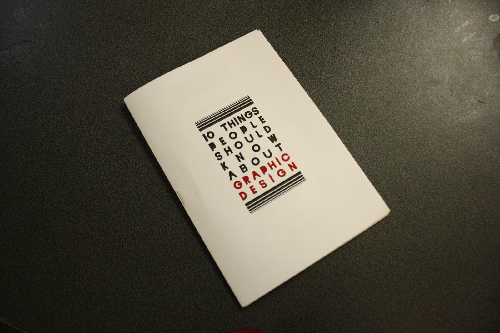
Below are the final images of my '10 things to know about graphic design' booklet.