Showing posts with label OUGD504. Show all posts
Showing posts with label OUGD504. Show all posts
Wednesday, 15 January 2014
Tuesday, 14 January 2014
Monday, 13 January 2014
OUGD504: Design for web, Final
Here is my final designs for the website.
For my final design I was trying to reflect a combination of clean, simple, modernist elements to mirror the intelligent and complex design of Shigeo Fukuda. I used grey and white colours for the pages and added the red to reflect Japan.
Homepage:
The homepage features a small introduction to what the website is about. If I had the skill I would have had the pictures in the background slowly transitioning between different pictures of Fukuda. If I could code the site fully the logo would also be a homepage button.


About:
The about page gives you a more in depth read on who Shigeo Fukuda is and his life. Again there is a scroll down option which allows you to view the whole page.
 Here is what the about page looks like in full:

Shop:
The shop allows you to buy Shigeos fantastic work, in different sizes. If I was able to fully code the website, when adding work to your shopping cart the figures would add up and total at the side of the page. When you click checkout I would have this to then link you to PayPal where you could safely finish your transaction. The arrows at the side would also allow you to click back and forth through his work. I found that when looking at websites which didn't have any interactive features, or any websites without the option to go further from the site, it felt a bit basic, and a bit out dated. I added the shopping element because it confirms to you that the website is up to date and it allows you to further interact with the site, rather than just clicking from page to page.

Here is the site with out the mac, for a better view of what it looks like:


For my final design I was trying to reflect a combination of clean, simple, modernist elements to mirror the intelligent and complex design of Shigeo Fukuda. I used grey and white colours for the pages and added the red to reflect Japan.
Homepage:
The homepage features a small introduction to what the website is about. If I had the skill I would have had the pictures in the background slowly transitioning between different pictures of Fukuda. If I could code the site fully the logo would also be a homepage button.

Timeline:
Here is the timeline page, which gives you a timeline of Fukudas work and the awards he's won over the years. You can scroll down to view the rest of the page.

Here is the timeline page fully opened up:
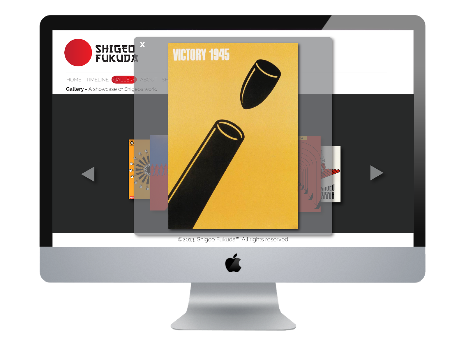
Gallery:
The gallery page lets you view Shigeos work, the arrows either side let you click back and forth through each image.

When you click on an image it pops up even bigger so you can view it in detail. I added this interactive element because it gives the user more freedom when navigating around the page:
About:
The about page gives you a more in depth read on who Shigeo Fukuda is and his life. Again there is a scroll down option which allows you to view the whole page.


Shop:
The shop allows you to buy Shigeos fantastic work, in different sizes. If I was able to fully code the website, when adding work to your shopping cart the figures would add up and total at the side of the page. When you click checkout I would have this to then link you to PayPal where you could safely finish your transaction. The arrows at the side would also allow you to click back and forth through his work. I found that when looking at websites which didn't have any interactive features, or any websites without the option to go further from the site, it felt a bit basic, and a bit out dated. I added the shopping element because it confirms to you that the website is up to date and it allows you to further interact with the site, rather than just clicking from page to page.

Here is the site with out the mac, for a better view of what it looks like:


Sunday, 12 January 2014
OUGD504: Design for print and web, Final.
Here is my final proposal for my Print and Web.
My final concept:
I designed the promotional material and content to a gallery which focused on hand gestures and their power to communicate. As the gallery is focusing on non-verbal communication, I decided to create the gestures out of typography, I wanted to show how although we use our hands to communicate, depending on the identifiable shape the gesture can still hold meaning even if it's not preformed by the hand.
I designed eleven posters, which were of the most common hand gestures.
I designed a leaflet, and two promotional posters.
I also designed a booklet which would be available free at the exhibition, and it gives you information on the different hand gestures; their origins and their meanings in other countries.
Badges for staff and photographers are also a proposal.

Here is the colour swatches I used, along with the font. I used the font as it was bold and it made an impact. I chose the colours because of the combination of cold and warm colours. I think the contrast worked really well, the red created an impact and the blues added the serious element.

Here are the posters I designed for the exhibition:
*If I had enough time I would of screen printed the posters.


Here is the promotional material:
Leaflet, front and back:


Promotional posters:


I have designed a website for the exhibition. The website gives you information on what the exhibition is, where it is, and when. I've also proposed how it would look on an iPhone. I wanted the website to be simple, easy to navigate round:


I've also quickly mocked up a Facebook page, which would be used to help advertise the event:

Here is the publication for the gallery:
I have proposed some mock-ups of what the promotional material would look like on the street:
Billboard:

Bustop:

I made a mock-up of what the gallery would look like. Unfortunately I was unable to take photos. I also have proposals for what else would be included in the exhibition:
- Cases around the exhibition with giant foam glyphs/ type inside. The audience are allowed to use the foam letters to create whatever they want out of the type, but are advised to try and create hand gestures. Projectors above the cases would project the image of the foam glyphs onto the wall, so everyone can see what people are making. The idea of the exhibition is to get people to connect, so interactive games is a great way of getting people to do so.
- There would be points around the exhibition where people could put on head phones and listen to the origins and history of different hand gestures.
- There would also be a place for people to write what hand gestures meant to them, so for foreign people visiting they could give people an insight into what hand gestures mean in their specific countries.

Through out the exhibition I want the hand gestures painted on the wall:

Items to purchase:
As well as t-shirts and canvas bags, novelty foam hands would be available to purchase, these foam hands would be the ones made out of the type, here is an example:


Photos of my final prints:


My final concept:
I designed the promotional material and content to a gallery which focused on hand gestures and their power to communicate. As the gallery is focusing on non-verbal communication, I decided to create the gestures out of typography, I wanted to show how although we use our hands to communicate, depending on the identifiable shape the gesture can still hold meaning even if it's not preformed by the hand.
I designed eleven posters, which were of the most common hand gestures.
I designed a leaflet, and two promotional posters.
I also designed a booklet which would be available free at the exhibition, and it gives you information on the different hand gestures; their origins and their meanings in other countries.
Badges for staff and photographers are also a proposal.

Here is the colour swatches I used, along with the font. I used the font as it was bold and it made an impact. I chose the colours because of the combination of cold and warm colours. I think the contrast worked really well, the red created an impact and the blues added the serious element.

Here are the posters I designed for the exhibition:
*If I had enough time I would of screen printed the posters.


Here is the promotional material:
Leaflet, front and back:


Promotional posters:


I have designed a website for the exhibition. The website gives you information on what the exhibition is, where it is, and when. I've also proposed how it would look on an iPhone. I wanted the website to be simple, easy to navigate round:


I've also quickly mocked up a Facebook page, which would be used to help advertise the event:

Here is the publication for the gallery:
I have proposed some mock-ups of what the promotional material would look like on the street:
Billboard:

Bustop:

I made a mock-up of what the gallery would look like. Unfortunately I was unable to take photos. I also have proposals for what else would be included in the exhibition:
- Cases around the exhibition with giant foam glyphs/ type inside. The audience are allowed to use the foam letters to create whatever they want out of the type, but are advised to try and create hand gestures. Projectors above the cases would project the image of the foam glyphs onto the wall, so everyone can see what people are making. The idea of the exhibition is to get people to connect, so interactive games is a great way of getting people to do so.
- There would be points around the exhibition where people could put on head phones and listen to the origins and history of different hand gestures.
- There would also be a place for people to write what hand gestures meant to them, so for foreign people visiting they could give people an insight into what hand gestures mean in their specific countries.

Through out the exhibition I want the hand gestures painted on the wall:

Items to purchase:
As well as t-shirts and canvas bags, novelty foam hands would be available to purchase, these foam hands would be the ones made out of the type, here is an example:

Photos of my final prints:


Subscribe to:
Posts (Atom)