Showing posts with label Design for web. Show all posts
Showing posts with label Design for web. Show all posts
Wednesday, 15 January 2014
Monday, 13 January 2014
OUGD504: Design for web, Final
Here is my final designs for the website.
For my final design I was trying to reflect a combination of clean, simple, modernist elements to mirror the intelligent and complex design of Shigeo Fukuda. I used grey and white colours for the pages and added the red to reflect Japan.
Homepage:
The homepage features a small introduction to what the website is about. If I had the skill I would have had the pictures in the background slowly transitioning between different pictures of Fukuda. If I could code the site fully the logo would also be a homepage button.


About:
The about page gives you a more in depth read on who Shigeo Fukuda is and his life. Again there is a scroll down option which allows you to view the whole page.
 Here is what the about page looks like in full:

Shop:
The shop allows you to buy Shigeos fantastic work, in different sizes. If I was able to fully code the website, when adding work to your shopping cart the figures would add up and total at the side of the page. When you click checkout I would have this to then link you to PayPal where you could safely finish your transaction. The arrows at the side would also allow you to click back and forth through his work. I found that when looking at websites which didn't have any interactive features, or any websites without the option to go further from the site, it felt a bit basic, and a bit out dated. I added the shopping element because it confirms to you that the website is up to date and it allows you to further interact with the site, rather than just clicking from page to page.

Here is the site with out the mac, for a better view of what it looks like:


For my final design I was trying to reflect a combination of clean, simple, modernist elements to mirror the intelligent and complex design of Shigeo Fukuda. I used grey and white colours for the pages and added the red to reflect Japan.
Homepage:
The homepage features a small introduction to what the website is about. If I had the skill I would have had the pictures in the background slowly transitioning between different pictures of Fukuda. If I could code the site fully the logo would also be a homepage button.

Timeline:
Here is the timeline page, which gives you a timeline of Fukudas work and the awards he's won over the years. You can scroll down to view the rest of the page.

Here is the timeline page fully opened up:
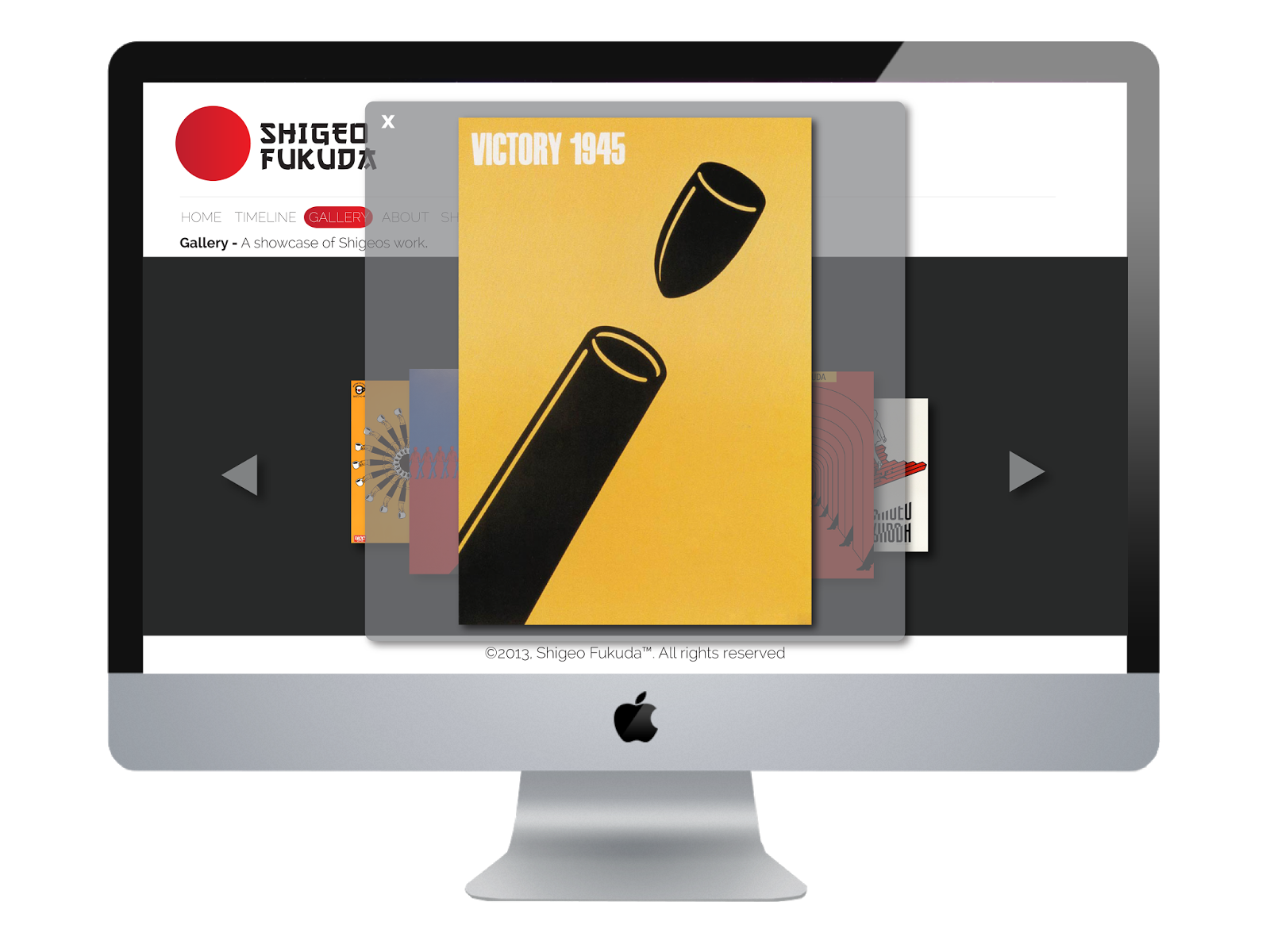
Gallery:
The gallery page lets you view Shigeos work, the arrows either side let you click back and forth through each image.

When you click on an image it pops up even bigger so you can view it in detail. I added this interactive element because it gives the user more freedom when navigating around the page:
About:
The about page gives you a more in depth read on who Shigeo Fukuda is and his life. Again there is a scroll down option which allows you to view the whole page.


Shop:
The shop allows you to buy Shigeos fantastic work, in different sizes. If I was able to fully code the website, when adding work to your shopping cart the figures would add up and total at the side of the page. When you click checkout I would have this to then link you to PayPal where you could safely finish your transaction. The arrows at the side would also allow you to click back and forth through his work. I found that when looking at websites which didn't have any interactive features, or any websites without the option to go further from the site, it felt a bit basic, and a bit out dated. I added the shopping element because it confirms to you that the website is up to date and it allows you to further interact with the site, rather than just clicking from page to page.

Here is the site with out the mac, for a better view of what it looks like:


Sunday, 12 January 2014
OUGD504: Design for Web, idea development
I started with some website design ideas, I sketched out what I thought was appropriate from my research and website analysis. I used the conventional navigation bar along the top and the side, and tried adding my logo to see how it'd look on the page. I tried making the navigation bar a bit different, using influence from Shigeos design (See the first website design sketch below)


I combined a selection of the designs and came up with this idea below. I was keeping the design minimal and easy to navigate around, I decided on having a home page, a timeline, about, gallery and shop.

I worked out some measurements using wire frames, this was for the benefit of when I code the site:

I put my design onto the computer to see what if it worked digitally, I also played around with some other designs which I'd previously sketched:
I was keeping with the minimal theme similar to Fukudas work, and I added the red to represent japan.


Here is the site which I showed in crit:
I kept everything clean and simple, again I kept the red.


I added a loading page just as a proposal, I may not use it but It was fun designing and seeing what I could produce.

After the crit I then developed that idea further, I felt like the original design was a bit clunky and I didn't like the side navigation bar. I tried to make my design more compact and professional:


Here is some screen shots of my development:


After designing my site on illustrator I had to then use Dreamweaver to code it together. I struggled with this majorly but with a little help I managed to get it all done.
I started by making my root folder, and inside this had an image folder for my pages and navigation bar:


I used a style sheet to create a main container, then a logo container, a navigation bar, the body, and the header of my site, each page is laid out the same so it was easy enough to do this part:


I then applied these to the HTML page using <div> tags
On the HTML page I then added the code for the navigation bar, with all the pages linking up to the saved HTML, here is an example:

Wednesday, 11 December 2013
OUGD504: Design for web, Final web crit
Again like the final print crit, we laid out our work and let the other half of the class anonymously crit it.


Questions:
Is the navigation bar readable and legible?
The target audience are students are emerging graphic designers, is the content appropriate, would you be interested?
Feedback
Student 1:
The navigation bar works effectively with the website. It is very clear, readable + easy to use. It is also to keep the same navigation bar consistent throughout your website.
I would be interested in looking at this website. It's appropriate for students as it is useful + clear informative layout.
Might be best to change the order of your pages to home, about, timeline, gallery, shop instead of timeline before about - or could the timeline be put onto the about page?
Student 2:
Yeah I think it is is very appropriate - covers everything you would really want to know. On the gallery page, maybe have some info on what each piece of design is about. Maybe have links to other designers who have similar sort of work for people who are interested. Really like the colour scheme.
Student 3:
The timeline is readable and legible, the red behind works well with the subject matter, simple and clean, like his work.
I think it is appropriate to students and designers because it's simple and well designed.
I think you should consider if you need the about page, because the timeline offers you what he's done throughout his life and the gallery informs you about his work (you could use a rollover image so when you move the mouse over the image it gives you information on it)
The timeline could also be a continuous scroll downwards?
OUGD504: Design for web, Web crit
We were placed into groups and asked to talk through our work so far for web.
Here are the images I presented:


I presented my ideas, scamps, wire frames, the concept to my website and the content which I will be including.
Feedback:
- Research into anchor links for pages which scroll
- Look more into Japanese design, and the colours
- Draw out detailed scamps
- investigate different colours on the website
- Get help with coding from other peers
- Don't lose the target audience
- Consistent navigation
- Tone of voice
- Use colours pallets
- Work in pixels
- Mobile/ mac layouts
Dot the I's cross the T's!
Here are the images I presented:


I also proposed a loading page

I presented my ideas, scamps, wire frames, the concept to my website and the content which I will be including.
Feedback:
- Research into anchor links for pages which scroll
- Look more into Japanese design, and the colours
- Draw out detailed scamps
- investigate different colours on the website
- Get help with coding from other peers
- Don't lose the target audience
- Consistent navigation
- Tone of voice
- Use colours pallets
- Work in pixels
- Mobile/ mac layouts
Dot the I's cross the T's!
OUGD504: Creative suite workshop 4
Find errors in an InDesign document designed for print:
Group Work - Sam Cook & Dan Everitt


The Tree link is missing - this can be rectified by relinking the file under the links palette. Double click red circle to open files for re linking.
The background colour on the cover doesn't fit to the bleed - stretch it to fit.
2 extra pantone swatch colours being used - get rid of them before being saved to print. Colours seen through separations preview (Window > Output > Separation Preview.

1 blue was RGB. R=112 G=176 B=220 NOT CMYK.Colour mode can be changed by double clicking the colour icon, and swapping the mode to CMYK. Some slight colour change may be noticeable.
Group Work - Sam Cook & Dan Everitt


- - -

Background doesn't go to the bleed line.


The Tree link is missing - this can be rectified by relinking the file under the links palette. Double click red circle to open files for re linking.
The background colour on the cover doesn't fit to the bleed - stretch it to fit.
2 extra pantone swatch colours being used - get rid of them before being saved to print. Colours seen through separations preview (Window > Output > Separation Preview.

1 blue was RGB. R=112 G=176 B=220 NOT CMYK.Colour mode can be changed by double clicking the colour icon, and swapping the mode to CMYK. Some slight colour change may be noticeable.
Imagery of yellow bird is 72dpi not 300dpi. Not enough info for the image resolution to be resized and enlarged.
Full colour bird is RGB, not CMYK (3rd small image down) - can be changed and checked in CMYK, as well as checking Gamut before conversion.
Image is scaled and has a resolution that is too high. This can be fixed in Photoshop, and will automatically update in InDesign.
Last colour is registration not black on the website link. Text can be changed through looking at swatches and seen through the 'view' button shown in the separations preview.
Colour can be applied to greyscale images in photoshop, saved as a TIFF file. A spot colour can then be added in InDesign. Alternative way of adding colour.
Subscribe to:
Posts (Atom)