At the beginning of the class we re designed the buttons which are going to go onto the website. Last week we made the home button, and to get all the buttons the same we have re made it along with the other buttons so they are all the same size.
The buttons include: Home, Work, About, Contact
We then went through the process of placing the buttons into dreamweaver, which we also previously did last week.
Make sure the <div> and the </div> for each script line up.
To insert your roll over image go to insert > image objects > rollover image
You have to make sure you have clicked in the correct space of code. The correct space is in between the <div id="button"> and the </div>
This code means the button links, if a hashtag is present it means the link is going nowhere at the moment:
Change the hashtag to 'about.html', and the button will link to the index (home page). You can do this with all the button codes.
To make sure it links on the website: if you type 'about' in between the <body> (so you know your links are working later) and save this as about.html (or index.html, or work.html etc.) when you click the links on the website they should work.
For example..
<a href='#' should become <ahref='about.html'
then if you save some writing between the body copy.. so 'this is the about page'.. go to save as and save this page as about.html. The links on the site will then work correctly.
We now are going to divide up the content page. You need to pre plan your dimensions of the page before you go into dreamweaver to allow for content to be evenly displayed
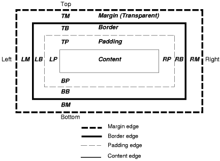
Here is a diagram called the 'box model'
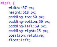
Here is an example of the layout of our page:
We need to add the padding to the layout of our page. The relative means they slot relative to each other, and the float means where it is going, so either left or right.

Do the same for the right.
If you then go back to the source code and type:
And if you type your text either between the left div or the right div paste your text in. When you open your website your text should be on the left or right with an indent of 50 pixels
You can then add more text (we will use Loren Ipsum), using <p> for a paragraph break. <br> means line break.
Ive put my text on the right hand side
Typing h1 into the stylesheet allows you to change the heading
You can apply this to whatever text by
We are now going to place an image onto the page. Opening up an image in photoshop you need to make sure the image is small enough to fit inside the box so as big as or smaller then: 516 by 437
You need to save the image as a JPEG
If you then go onto the source sheet and between the <div id:left> you can go to insert image, and place the image which you have saved as a jpeg.
Other types of content:
Videos - Upload your video onto 'vimeo' it then allows you to embed your video, and gives you the code.
Audio - Use Soundcloud to embed it onto your website.
Forums
(Vimeo and Soundcloud uses their sites band width on your site, so you are not using your own, or having to buy your own band width. It also streams it online, so you can watch it automatically)
You can also use http://lokeshdhakar.com/projects/lightbox2/. Which allows you to upload image galleries which are easy to flick through.
Make sure you make scamps and wireframes for your web design!!!!
Make sure you make scamps and wireframes for your web design!!!!


No comments:
Post a Comment