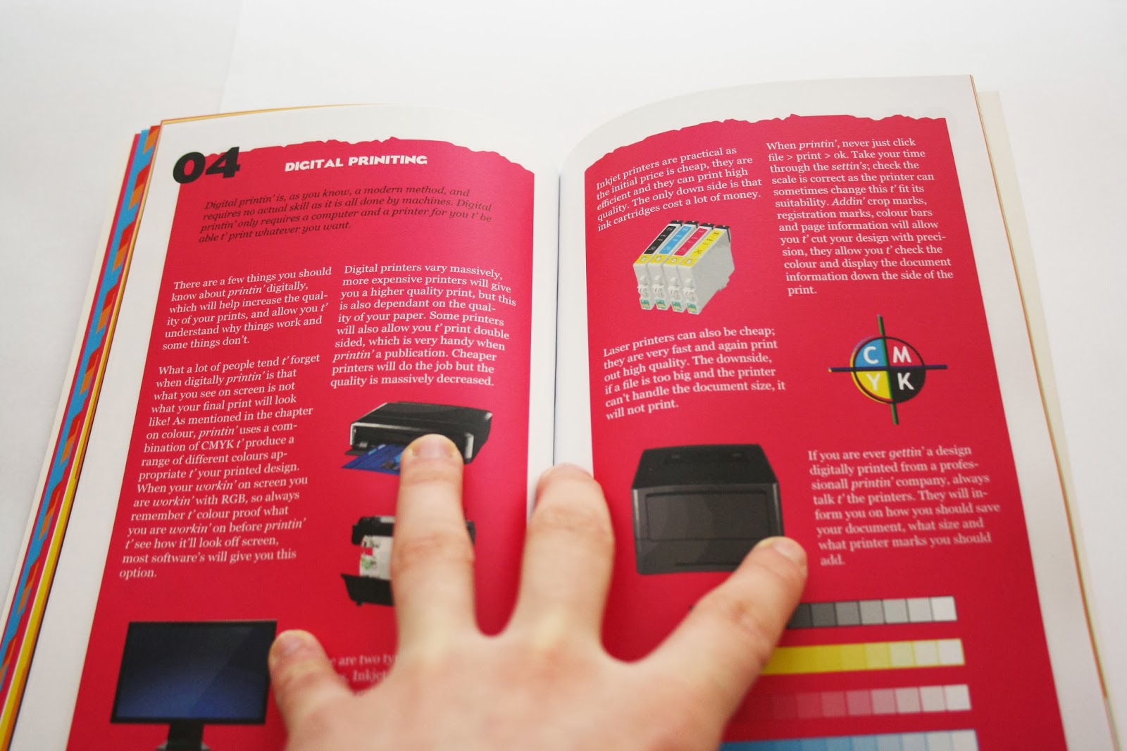
The final format of my book is 5 x 8 inches.
It's perfect bound, with uncoated white as the inside stock and thick glossy white as the front cover.
The book was printed by Blurb, who use offset printing.
The book uses the colours used in Pantones Hexachrome printing; cmykog.
The font on the front cover is Eagle Bold. I chose it as it's very bold, and has sharp edges, I thought this worked well the rigid edges on the colour. The rigid edge is in fact the mountain scape from the top of Helvellyn.
The introduction is plain and clear and gives you a brief explanation of what is in the guide, and what they can expect.
Through out the book on individual pages I've added northern phrases, but related them to print. I believe it keeps the northern theme running through out the book, it adds a bit of humour so it's not so serious.
The chapters are all colour coded; Cyan, Magenta, Yellow, Black, Orange and Green. The mountain by the side of each chapter is the mountains in the Lake District.
Each chapter is separated with a title page. I wanted to include an interesting use of type into my guide, I believe it adds extra visual aids for the user, instead of pages and pages of writing.
I created a pattern out of the mountains and added it to the background of some of the pages. I wanted the guide to be colourful, in your face and interesting to pick up and look at.
I strutted my book so that the text was in columns of two on each page. I found this was the best way to fit all the information on the page.
For the processes I used two columns per page, this gave me enough room to put all the information that was needed, it also compliments the thin style of the book.
As you can see, on some pages I arranged the different mountains as the background. I kept the mountains theme running through out the book.
I've also added a poster with design book, which is one of the quotes taken out of the book.


No comments:
Post a Comment