Studio Session 1, Fibonacci sequence, Golden Ratio, Rule of Thirds
In our Design Principles session Phil introduced us to the Fibonacci Sequence and how it relates with layout design:
In mathematics, the Fibonacci numbers or Fibonacci series or Fibonacci sequence are the numbers in the following integer sequence:

The sequence allows for you to arrange your layout in a set way which is equal and in proportion. The Fibonacci sequence derives from sea shells as the spirals are all naturally in line and parallel.
If applying Fibonacci's sequence to type:
55 pt title should be complemented with 34pt body cop.
The Golden Ratio is similar to the Fibonacci sequence. It is a mathematical equation that is used to make things proportionate and aesthetically pleasing to the eye.
http://www.sciencedaily.com/releases/2009/12/091221073723.htm
'Also know the divine proportion, the golden ratio describes a rectangle with a length roughly one and a half times its width. Many artists and architects have fashioned their works around this proportion. For example, the Parthenon in Athens and Leonardo da Vinci's painting Mona Lisa are commonly cited examples of the ratio.'
"When you look at what so many people have been drawing and building, you see these proportions everywhere," Bejan said. "It is well known that the eyes take in information more efficiently when they scan side-to-side, as opposed to up and down."
1.62 is the golden number used to find the next rectangle in the sequence, for example:
52 /1.62 = 34.56 (35)
The Rule of Thirds
This is a way of simplifying the golden ratio. The rule of thirds governs the placement of points of interest in a scene. Divide any given image into thirds both horizontally and vertically. You will get 9 grids.
According to the rule of thirds, the vertices of those lines (where the
lines cross) are the ideal placement for points of interest.
For a task we were asked to divide pages of magazines up to help us understand the rule.
As you can see above the images and the texts in a few of the magazines lay in between the folded lines. The rule of thirds has been applied.
Studio Session two: Canons & Grids
Van de Graaf canon
Wikipedia:
The Van de Graaf canon is a historical reconstruction of a method that may have been used in book design to divide a page in pleasing proportions. This canon is also known as the "secret canon" used in many medieval manuscripts and incunabula. The geometrical solution of the construction of Van de Graaf's canon, which works for any page width:height ratio, enables the book designer to position the text body in a specific area of the page. Using the canon, the proportions are maintained while creating pleasing and functional margins of size 1/9 and 2/9 of the page size. The resulting inside margin is one-half of the outside margin, and of proportions 2:3:4:6 (inner:top:outer:bottom) when the page proportion is 2:.
There is a certain method of constructing these scaffolding like lines. Draw a cross on the page, draw a line of the centre, draw from the bottom left corner to the centre, then from the bottom right to the centre, then draw a shape like a boetie near the top where the two lines meet.
The large margin space at the bottom allows for whoever reads the page has somewhere to hold without their hands getting in the way of the text or image.Leading
Width of a column.
-More than design or format
-legibitlty
-Printed text is read by the eye of a distance of 30 - 35 cm
-Empirical rule: 7 words per line or text of any length
-To keep the area light and open, we must consider leading
-Overshort and overlong lines tire the eye
-Overlong lines are strenuous to read.
The key is the ease of reading
Text must not impair the rhythm of reading
This can not apply to titles and subtitles.
Margins and Proportions
-Influence of overall feel of page
-Too small looks overfull
-Too large looks exagerated
-Well balanced - agrreable impression
Bad proportion:
1x1x1x3
Side margins are the same
-Indecision and dullness
Well proporationed
4x3x37
Right hand mage due to larger left margin
More applicable to literature
Luxurious and increase print cost
The type area
1 & 2 grid margins
Is it all to do with perception?
Studio Session 3
Construction
Before applying a grid you need to understand what it is for. It's ideal to know the print method and paper quality etc. before starting. You always start with a sketch, it makes your job easier more reliable and quicker in the long run. Thumbnails should be proportionate to your final layout.
one column of text restricts the positioning of your images. You shouldn't guess where your images are aligning up. Try to use several columns by using sub dividings, 2,3,4,5,6 etc.
Disadvantage of 6 coloum systems are:
Lines of text will be more narrow.
Small type face will have to be used.
For statistics, figures, graphs and trend line publications use a 4 column system layout.
Width of the column dictates the text space.
Thumbnails
The idea is that you want a variety of ideas. Don't rely on one set of thumbnails. Enlarge a small proportion of them to try different ideas and see if they work on a larger scale.
Apply type to columns
If my column is x height, how do i know how to fit it in. The top of the text should start at the blush (the top of the grid), and the bottom should lay along the bottom of the grid. You should play around with point size and leading etc. takes time to work it out.
To know you have the correct point size you'll have the same amount of lines in every field (A section made from splitting up the columns)
eg.
column length 15 cm, point size 10 leading 15.
Work from this as a loose example.
Font Height
If you find the smallest point size for your body copy, draw a line on the highest ascender and lowest line....
Type & Picture
8 field grid
A4 paper size for this example, 8 and 20 field grids.
8 and 16 fields give you a range of possibilities.
You can use the grids with or without type.
Grids are just a tool you can use which you can use to make interesting and balanced design.
Studio session 3
Stuff to know and find out:
Layout Designs:
Abraham Games


Neasden control center (Steven Smith)


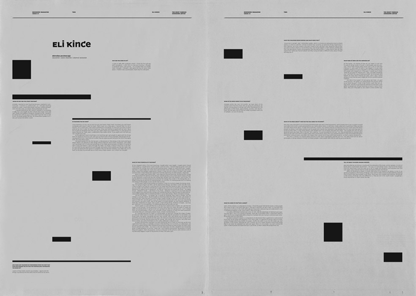
Newwork magazine


Nozine


Paul Rand

Session 4
We all presented our answers to the questions we were given.
Pagination:
The sequence of numbers assigned to pages in a book or periodical.
Stuff to research:
Greeking
Ratio numbers
Ligatures
Measures
Rules & Boxes
Golden ratio
Peer reviews on my work:
- Very simple
- Lack of Colour
- Traditional children's book feel
- Type matches the image
- Boarder works with the text and image
- Needs to see what would be put on opposite
- Maybe centralize the text
- Boarder may need adjusting for binding
- Simple and easy to read
We individually went around the class writing feedback for others work. We then discussed the comments in groups, looking at what was a common point and how i could improve my design. Simplicity was a common comment but it didn't really help my work. I was told there was a lack of colour which made the layout quite bland, I'll experiment adding colour, but as my design is meant to be simple I'll work with only adding one or two colours and not making the layout too cluttered.


No comments:
Post a Comment