In our third studio session we looked at logos, specifically breaking them down to their roots and finding out the meaning behind logo designs.
Each table was given the old NASA logo to look at. As a class we discussed why the NASA logo was how it was. The logo came in black and red, the red being a sign of patriotism, it also showed danger and adventure. Space exploration is a dangerous task and red highlights this. The black was to stand out on the white, on the suits and on the space shuttles. The font was very futuristic, as is space travel, and the joining of the A and the S could almost be interpreted as tubing, the connection of the astronaut and the space shuttle.
When designing a logo the designer has to think of how they want people to interpret their logo, so really the it can be interpreted however you want. The elements of the design will help you sculpt this interpretation.
We were asked to bring in five other logos as a preparatory task, I used the new Nasa logo, the Rover logo, the Penguin books logo, the MTV logo and the Warner Bros. logo. We were asked to present to our groups what we thought the logos were meant to be interpreted as, and how they can be broken down.
NASA
The new NASA logo uses all the colours of the American flag which shows patriotism. The blue also representing space/ the nights sky, and the red again showing danger and exploration. The circle is representative of planets and the white lines showing the orbit. The font is very official and is very bold, a lot different to the old font. Apparently the font was changed after 7 people died after a space shuttle failed to launch, they no longer wanted the original font to be linked to the death of astronauts.
Rover
The Rover logo incorporates a viking ship, I see this as almost Rover being the 'elite', similar to the vikings. Also Viking ships were made with great sustainability, a reason for them maybe placing this on their logos. The colours and the font are very formal, as if Rover is trying to be represented as a respectable presentable car dealership.
Here is the actually reasoning behind the name 'Rover' and the viking ship:
'Rovers are folk who rove about, rather like Vikings - hence the Viking ship emblem that has been used on Rovers in various forms since the beginning. It went very stylised and year-2000 on the original SD1s, but later models reverted to the current badge, first used on the P6.'
Penguin
My thoughts on the penguin logo were that the cartoon penguin is quite playful, and penguin books are usually childrens books. I was completely wrong as there are two types, Puffin books, which are for children, and Penguin books which are more adult fiction. I was told the reason the penguin is used is because its black and white, and books are written in black and white. The orange is just the penguin colour label for fiction books.
The MTV logo is designed for teenagers hence the playful colours and font. The MTV logo was designed with so many different colour variations, I picked this one as it was one of the earlier designs from the 90's. When asked what colour the designers wanted the logo to be the said no colour, the logo would be and black and white could change for any type of occasion.
Warner bros.
I see the Warner Bros. logo as being a symbol of strength and power. Its in the shape of a family crest, hence the name Warner Brothers. The gold indicating power and wealth, along with the royal blue showing royalty. The font at the front is very official and bold, and the initials at the back are a lot more playful, which corresponds with the films they produce. The logo being in the sky showing that they are above everybody else, above the other competitors.
As an extra task for the session I decide to choose three Logos from three of my group mates and research further into them.
ABC logo:
Starbucks logo:
ABC logo:
Shape and colour of the ABC logo:
The American Broadcasting Company has changed several logo designs since its inception in 1943. The earliest ABC logo was introduced in late 1943 and consisted of an icon of a microphone, with the letters “T” and “V” on its left and right sides respectively. The letters “ABC” were vertically aligned within the image of the microphone.
In 1961, the “circle logo” was designed by the legendary graphic designer, Paul Rand. The logo consisted of a simple black circle with the lowercase letters “abc”. This version was the cornerstone of the network’s clear and cohesive advertising and communications. The use of negative space, and simplicity, combined in a circle, provided a clear and consistent message to the audience.
In 2007, the network introduced a 3D version of the logo, while revamping it with a more modernistic, glossier and advanced look.
Font of the ABC Logo:
Being a media logo, the ABC logo still retains its simple font treatment for nearly 50 years. The usage of Bauhaus family font back in the 1960s, a font that can be easily duplicated, was was wise, brave and full of elegance and charm – particularly in an era when computer graphics were relatively unknown.
Union of Moscow Architects logo:
As a group we had discussed the logo which Leo had brought in. The colour red representing the Russian colour/ identity which is also followed by patriotism. The paper clip which can also be seen as a pencil and above forming into a star. The paper clip shows that the firm is a union, being together, paper clips hold together. The pencil linking to the fact that they're architect, and the star which is again related to russia. The clean, readable san serif font clearly incorporates the ideas and the professionalism of the company showing and consistent and concise message to the audience.
The design is very modern, its fresh and of high quality. In our group we discussed the stereotypes of Russia and what we'd associated with the country. The logo comes at a different angle and is trying to show Russia from a different perspective for what other countries might see it as, I think the logo really works.
Starbucks logo:
Starbucks Corporation is a coffeehouse chain based in the United States. Named after a character in the novel Moby Dick, it is the largest coffeehouse company in the world.
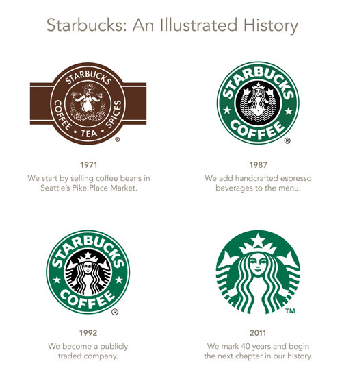
The current company logo, modeled after a 15th century Norse woodcut, is a mixoparthenos, or "twin-tailed mermaid, or siren as she's known in Greek mythology. The company and the logo have an interesting history.
In Jan 2011, Starbucks released a new version of the logo with a couple of big changes and some subtle changes as well. The two major changes made to the logo are
- They removed the name of the company "Starbucks Coffee". Their intention behind this maybe to expand the brand to beyond coffee. They have been talking about expanding into breakfast and there was also talk of a Bar/Lounge concept. This makes sense if they want to expand but maybe they should have kept the name "Starbucks" and removed "Coffee".
- They also removed the circle around the Siren and the logo now features just the Siren.
The original logo, as seen on the left, the Starbucks siren was topless and had a fully-visible double fish tail. The original logo has raised some controvery because of the bare chest, but the logo continues to appear on some of the products like the Starbucks Anniversary Blend 1 lb coffee bags. Both the original logos seem to be perfect on wooden crates.
In the second version, her chest was covered by her flowing hair, but her navel was still visible, and the fish tail was cropped slightly. The logo also inherited the stars from the Il Giornale logo.
In the current version, her navel and chest are not visible at all, and only vestiges remain of the fish tails.


No comments:
Post a Comment