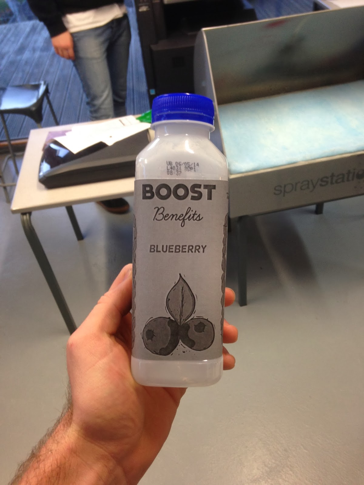
Today me and Sean took the feedback from our crit in Freds session and tried to improve our bottle design:
I redrew the flavours out so they were better quality:
We decided that we'd call the brand 'Boost Benefits'.
From the crit we were told to reconsider the bottle shape, and try and make the package design more colourful as it was quite bland on the mock-up we showed.
Below is the start of the new package design we came up with:
Here is the start of the dragon fruit packaging:
I drew up a few extra twigs and leaves to use as boarders for the information on the package:
We printed the packaging out (it was not finished) and tested out on a bottle shape which would be similar to our own:


No comments:
Post a Comment