
I decided upon the name 'Eclpse'. The reason for this being: the event is about the eclipse, and, taking away the 'I' is similar to when the moon passes over the sun, it makes it disappear.
I started by sketching out some ideas of how I wanted the logo to look. I wanted it to be very friendly and playful. I took the ideas I liked best and mocked them up digitally:
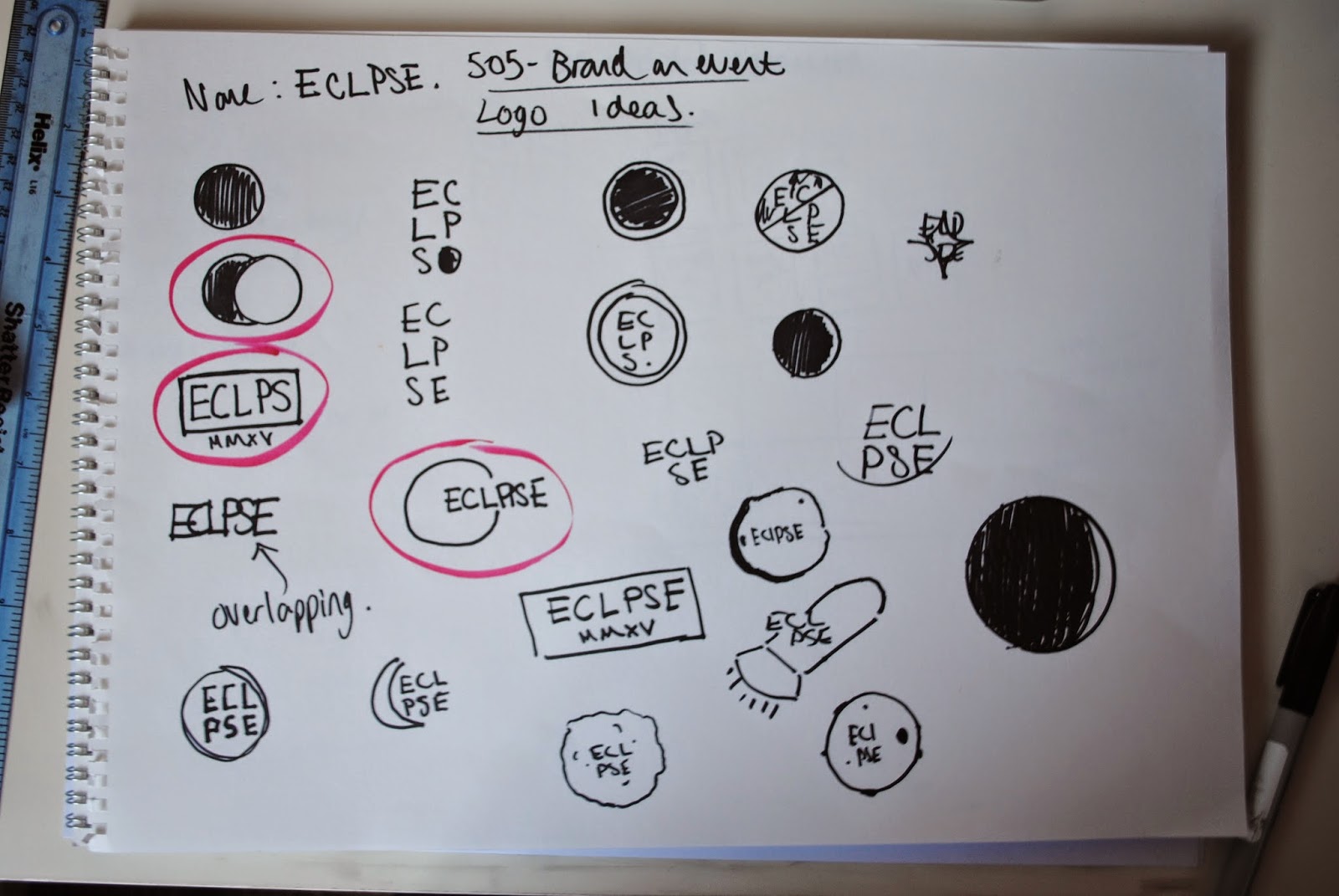
So i started by incorporate a circle into the design, as this represented the moon.


I tried to use a font that stood out, and was quite friendly.

Here I placed the font in front of the circle, acting like an eclipse.


I then created an eclipse out of two vectors and applied the name


I used 'MMXV' because I thought the moon has this pre historic sense about it, and the roman numerals helped show this.


I had a small crit with Jasper and Will and they said that it looks too much like a festival logo, and didn't suit children. So I went back to my sketches and produced this:

I liked the sketchy style as it was very playful and child like:


I tried out a few different fonts, and colours to see what worked best but found it really hard to decided on a font that best suited the occasion.


At this point I started to dislike the logo and drew up this one really quickly, which seemed to work really well:

I played around with the font, and the colours and came up with this final logo:

No comments:
Post a Comment