I started writing out what my concept was, what would be included in the design, who the audience was, the tone of voice etc.
The images below were ideas for my first concept which was two big posters:
I wanted bold colours and bold fonts, to attract interest.
For this idea I was going with the idea of dripping paint, I really like the font though, i'm not to sure about the design, it reminds me of a horror film.
Here i was playing around with the idea of three dimensional shapes, again the lines dripping down were meant to be paint:
Red and white work together very well, red is quite a fierce colour, it is very in your face.
Below are some contents page ideas. I started looking at colours fading into each other.
Here is my front cover design. The rigid edge is the view of the mountains at the top of helvellyn.
I tried it out with a few different colours but decided I liked this combination the best. It gave the book a warm feeling.
I used a combination of different grids to lay out my design.
I wanted to incorporate the mountains into my design, as they were related to the 'northern' concept.
I took the mountain idea further and decided that for each page I would label them with a different shaped mountain.
I then developed the labelling idea further, and used actual mountain shapes from the mountains which were situated around the Lake District.
I started adding single pages to the design which would feature northern words or phrases but made so they were suitable and appropriate for design.
For each page I had a double page spread with the chapter title spread across it. The idea was to add more colour and make it more interesting. I realised that there was going to be a lot of text in the book, so I wanted to even it out with large type, images and colour.
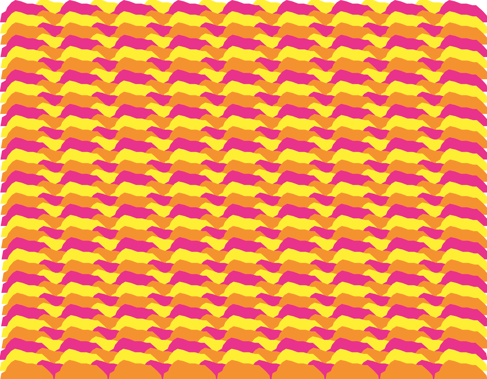
I designed a pattern which was made by overlapping the mountains, I thought it'd be a wonderful backdrop to some of my pages, and I could even chop it up and use it in a different format.
I placed it as the background to my format page, the colours were really friendly and warm, and worked really well together.
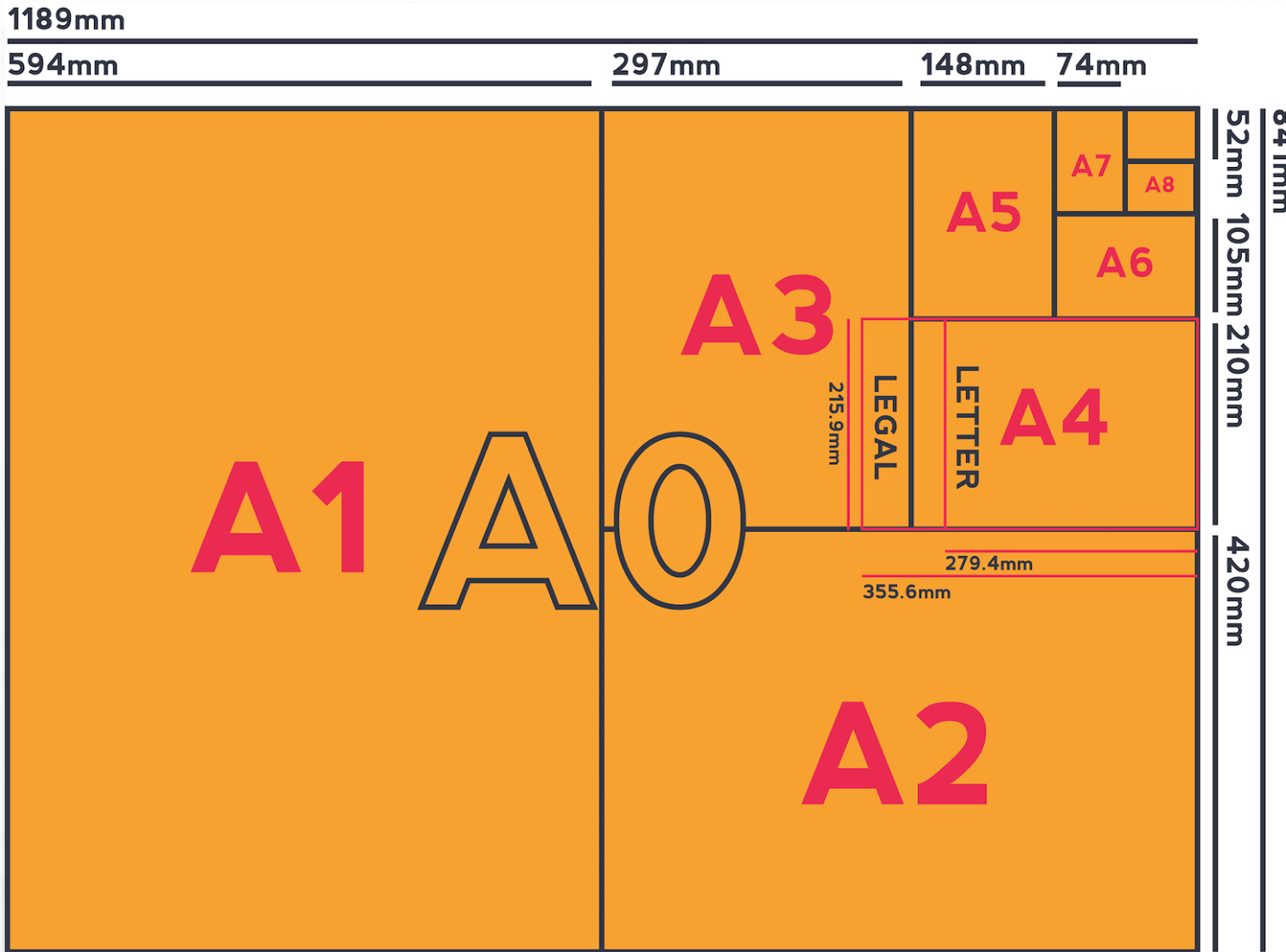
I designed my own paper size charts.
I was testing it with different colours to see what worked best.
Again keeping with the 'northern' theme, for the colour page I stretched out the mountains, and arranged them in the background. I wanted the page to be colourful and stand out.
Also using the mountains I created my own CMYK and RGB colour circles:


No comments:
Post a Comment