Here is the brief:

After looking at some existing cider labels I sketched out some initial ideas to get an idea of where I wanted to take it.


I then took my sketches, selecting parts from different ideas and tried them out on different designs.

I really wanted to incorporate big bold text into the logo, I want the badge to stand out.


I tried out different shapes. The brief asked for the badge to be able to work on bottles, on beer matts, on pumps and on glasses. I worked with shapes keeping that in mind.


I showed my initial designs to some of my friends and family for some feedback. They said maybe change the shape of the badge, keep it simple by just using a circle. Also, try different colours, the red and the pale yellow are bit to bland.
I took the feedback on board and tried re designing.
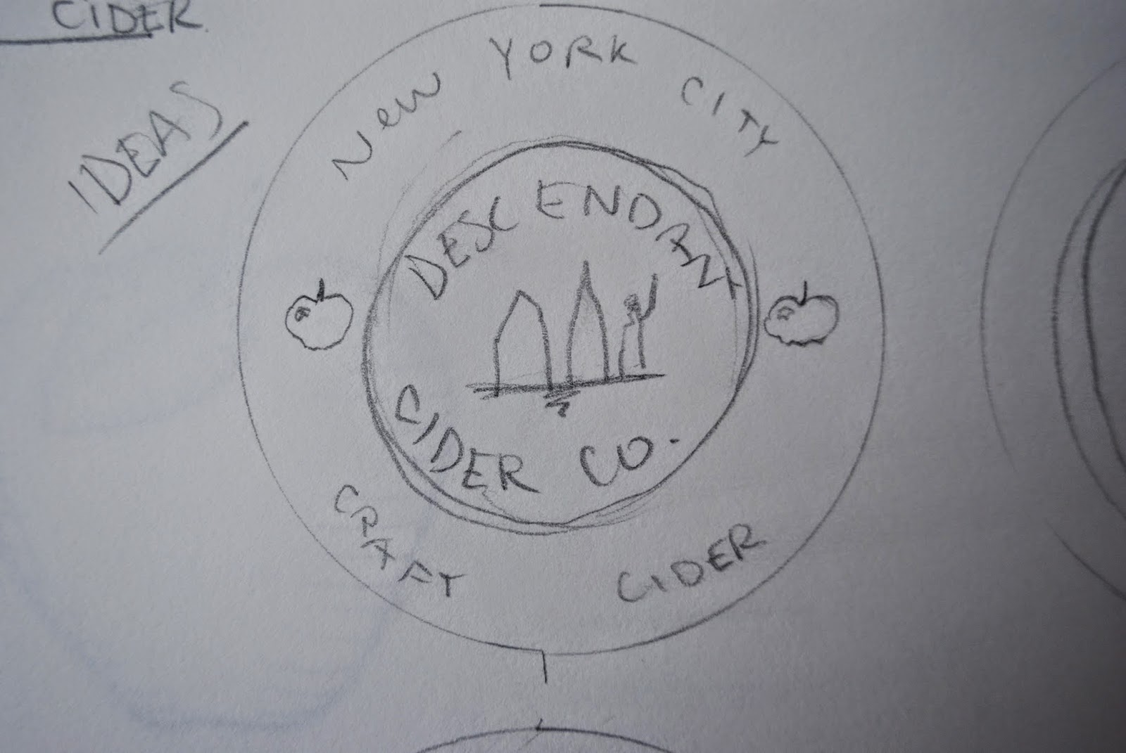
Here is the sketch that I worked off:


I added the illustrations at the top to give it a bit of class, and to try and make it look more official and traditional.

I needed an image to place at the top above the name, but I was very unsure on what to put on it. I tried three of the most recognised structures in New York.

Before deciding what to put as the image I tried different colours, I really like the orange/ red so I tried changing the cream colour.

I decided on an off white and the a dark blue.

I decided to put an apple as the logo which I thought fit very well:


No comments:
Post a Comment